-
There are no good, paper cycling maps for my region. There are 1:20,000 street maps for car navigation within the city, but they have absolutely no detail in the rural areas. There are 1:200,000 maps for long trips by car, but that's too big of a scale.
Ideally there would be high-quality printed maps at 1:50,000 scale (i.e. 1 Km in the real world is 2 cm in the map), with enough detail and some features:
-
Contour lines. Xalapa is in the middle of the mountains, so it's useful to plan for (often ridiculously steep) uphills/downhills.
-
Where can I replenish my water/food? Convenience stores, roadside food stands.
-
What's the quality and surface of the roads? This region is full of rural tracks that go through coffee and sugarcane plantations. The most-transited tracks can be ridden with reasonable "street" tyres. Others require fatter tyres, or a lot of skill, or a mountain bike, as they have rocks and roots and lots of fist-sized debris.
-
Any interesting sights or places? It's nice to have a visual "prize" when you reach your destination, apart from the mountainous landscape itself. Any good viewpoints? Interesting ruins? Waterfalls?
-
As many references as possible. The rural roads tend to look all the same — coffee plants, bananas, sugarcane, dirt roads. Is there an especially big tree at the junction of two trails so you know when to turn? Is there one of the ubiquitous roadside shrines or crosses? Did I just see the high-voltage power lines overhead?
Make the map yourself, damnit
For a couple of years now, I have been mapping the rural roads around here in OpenStreetMap. This has been an interesting process.
For example, this is the satellite view that gets shown in iD, the web editor for OpenStreetMap:
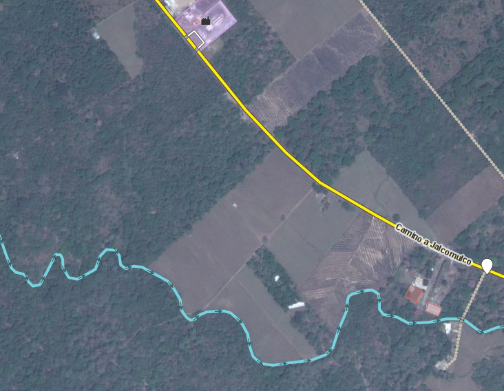
One can make out rural roads there between fields (here, between the blue river and the yellow highway). They are hard to see where there are many trees, and sometimes they just disappear in the foliage. When these roads are just not visible or 100% unambiguous in the satellite view, there's little else to do but go out and actually ride them while recording a GPS track with my phone.
These are two typical rural roads here:


Once I get back home, I'll load the GPS track in the OpenStreetMap editor, trace the roads, and add some things by inference (the road crosses a stream, so there must be a bridge) or by memory (oh, I remember that especially pretty stone bridge!). Behold, a bridge in an unpaved road:


It is also possible to print a map quickly, say, out of Field Papers, annotate it while riding, and later add the data to the map when on the computer. After you've fed the dog.

Now, that's all about creating map data. Visualization (or rendering for printing) is another matter.
Visualization
Here are some interesting map renderers that work from OpenStreetMap data:

OpenTopoMap. It has contour lines. It is high contrast! Paved roads are light-colored with black casing (cartography jargon for the outline), like on a traditional printed map; unpaved rural tracks are black. Rivers have a dark blue outline. Rivers have little arrows that indicate the flow direction (that means downhill!) — here, look for the little blue arrow where the river forks in two. The map shows things that are interesting in hiking/biking maps: fences, gates, viewpoints, wayside crosses, shelters. Wooded areas, or farmland and orchards, are shaded/patterned nicely. The map doesn't show convenience stores and the like.

GPSies with its Sigma Cycle layer. It has contour lines. It tells you the mountain biking difficulty of each trail, which is a nice touch. It doesn't include things like convenience stores unless you go into much higher zoom levels. It is a low-contrast map as is common for on-screen viewing — when printed, this just makes a washed-out mess.

Cycle.Travel. The map is very pretty onscreen, not suitable for printing, but the bicycle routing is incredibly good. It gives preference to small, quiet roads instead of motorways. It looks for routes where slopes are not ridiculous. It gives you elevation profiles for routes... if you are in the first world. That part doesn't work in Mexico. Hopefully that will change — worldwide elevation data is available, but there are some epic computations that need to happen before routing works on a continent-level scale (see the end of that blog post).
Why don't you take your phone with maps on the bike?
I do this all the time, and the following gets tedious:
- Stop the bike.
- Take out the phone from my pocket.
- Unlock the phone. Remove gloves beforehand if it's cold.
- Wait for maps app to wake up.
- Wipe sweat from phone. Wait until moisture evaporates so touch screen works again.
- Be ever mindful of the battery, since the GPS chews through it.
- Be ever mindful of my credit, since 3G data chews through it.
- Etc.
I *love* having map data on my phone, and I've gone through a few applications that can save map data without an internet connection.
City Maps 2 Go is nice. It has been made more complex than before with the last few versions. Maps for Mexico don't seem to be updated frequently at all, which is frustrating since I add a lot of data to the base OpenStreetMap myself and can't see it in the app. On the plus side, it uses vector maps.
MotionX GPS is pretty great. It tries extra-hard not to stop recording when you are creating a GPS track (unlike, ahem, Strava). It lets you save offline maps. It only downloads raster maps from OpenStreetMap and OpenCycleMap — the former is nominally good; the latter is getting very dated these days.
Maps.Me is very nice! It has offline, vector maps. Maps seem to be updated reasonably frequently. It has routing.
Go Map!! is a full editor for OpenStreetMap. It can more or less store offline maps. I use it all the time to add little details to the map while out riding. This is a fantastic app.
Those apps are fine for trips of a few hours (i.e. while the phone's battery lasts), and not good for a full-day trip. I've started carrying an external battery, but that's cumbersome and heavy.
So, I want a printed map. Since time immemorial there has been hardware to attach printed maps to a bike's handlebar, or even a convenient handlebar bag with a map sleeve on it.
Render the map yourself, damnit
The easiest thing would be to download a section of the map from OpenTopoMap, at a zoom level that is useful, and print it. This works in a pinch, but has several problems.
Maps rendered from OpenStreetMap are generally designed for web consumption, or for moderately high-resolution mobile screens. Both are far from the size and resolution of a good printed map. A laptop or desktop has a reasonably-sized screen, but is low resolution: even a 21" 4K display is only slightly above 200 DPI. A phone is denser, at something between 300 and 400 DPI, but it is a tiny screen... compared to a nice, map-sized sheet of paper — easily 50x50 cm at 1200 DPI.
... and you can fold a map into the size of a phablet, and it's still higher-rez and lighter and doesn't eat batteries and OMG I'm a retrogrouch, ain't I.
Also, web maps are zoomable, while paper maps are at a fixed scale. 1:50,000 works well for a few hours' worth of cycling — in this mountainous region, it's too tiring for me to go much further than what fits in such a map.
So, my line of thinking was something like:
-
How big is the sheet of paper for my map? Depends on the printer.
-
What printed resolution will it have? Depends on the printer.
-
What map scale do I want? 1:50,000
-
What level of detail do I want? At zoom=15 there is a nice level of detail; at z=16 it is even more clear. However, it is only until z=17 that very small things like convenience stores start appearing... at least for "normal" OpenStreetMap renderers.
Zoom levels?
Web maps are funny. OpenStreetMap normally gets rendered with square tiles; each tile is 256x256 pixels. At zoom=0, the whole world fits in a single tile.
The URL for that (generated) image is http://opentopomap.org/0/0/0.png.
If we go in one zoom level, to zoom=1, that uber-tile gets divided into 2x2 sub-tiles. Look at the URLs, which end in zoom/x/y.png:

http://opentopomap.org/1/0/0.png
http://opentopomap.org/1/1/0.png
http://opentopomap.org/1/0/1.png
http://opentopomap.org/1/1/1.pngLet's go in one level, to zoom=2, and just focus on the four sub-sub-tiles for the top-left tile above (the one with North America and Central America):

http://opentopomap.org/2/0/0.png
http://opentopomap.org/2/1/0.png
http://opentopomap.org/2/0/1.png
http://opentopomap.org/2/1/1.pngSo the question generally is, what zoom level do I want, for the level of detail I want in a particular map scale, considering the printed resolution of the printer I'll use?
For reference:
After some playing around with numbers, I came up with a related formula. What map scale will I get, given a printed resolution and a zoom level?
(defun get-map-scale (dpi tile-size zoom latitude)
  (let* ((circumference-at-equator 40075016.686)
	 (meridian-length (* circumference-at-equator
			     (cos (degrees-to-radians latitude))))
	 (tiles-around-the-earth (exp (* (log 2) zoom)))
	 (pixels-around-the-earth (* tiles-around-the-earth tile-size))

	 (meters-per-pixel (/ meridian-length pixels-around-the-earth))

	 (meters-in-inch-of-pixels (* meters-per-pixel dpi))
	 (meters-in-cm-of-pixels (/ meters-in-inch-of-pixels 2.54)))
    (* meters-in-cm-of-pixels 100)))

(get-map-scale 600      ; dpi
	       256      ; tile-size
	       16       ; zoom
	       19.533)  ; latitude of my town
53177.66240054532 ; pretty close to 1:50,000
All right: zoom=16 has a useful level of detail, and it gives me a printed map scale close to 1:50,000. I can probably take the tile data and downsample it a bit to really get the scale I want (from 53177 to 50000).
Why a tile-size argument (in pixels)? Aren't tiles always 256 pixels square? Read on.
Print ≠ display
A 1-pixel outline ("hairline") is nice and visible onscreen, but on a 600 DPI or 1200 DPI printout it's pretty hard to see, especially if it is against a background of contour lines, crop markers, and assorted cartographic garbage.
A 16x16-pixel icon that shows the location of a convenience store, or a viewpoint, or some other marker, is perfectly visible on a screen. However, it is just a speck on paper.
And text... 10-pixel text is probably readable even on a high-resolution phone, but definitely not on paper at printed resolutions.
If I just take OpenTopoMap and print it, I get tiny text, lines and outlines that are way too thin, and markers that are practically invisible. I need something that lets me tweak the thickness of lines and outlines, the size of markers and icons, and the size and position of text labels, so that printing the results will give me a legible map.
Look at these maps and zoom in. They are designed for printing. They are full of detail, but on a screen the text looks way too big. If printed, they would be pretty nice.
The default openstreetmap.org uses Mapnik as a renderer, which in turn uses a toolchain to produce stylesheets that determine how the map gets rendered. Stylesheets say stuff like, "a motorway gets rendered in red, 20 pixels thick, with a 4-pixel black outline, and with highway markers such and such pixels apart, using this icon", or "graveyards are rendered as solid polygons, using a green background with this repeating pattern of little crosses at 40% opacity". For a zoomable map, that whole process needs to be done at the different zoom levels (since the thicknesses and sizes change, and just linearly scaling things looks terrible). It's a pain in the ass to define a stylesheet — or rather, it's meticulous work to be done in an obscure styling language.
Recently there has been an explosion of map renderers that work from OpenStreetMap data. I have been using Mapbox Studio, which has the big feature of not requiring you to learn a styling language. Studio is a web app that lets you define map layers and a style for each layer: "the streets layer comes from residential roads; render that as white lines with a black outline". It lets you use specific values for different zoom levels, with an interesting user interface that would be so much better without all the focus issues of a web browser.

I've been learning how to use this beast — initially there's an airplane-cockpit aspect to it. Things went much easier once I understood the following:
The main OpenStreetMap database is an enormous bag of points, lines, and "relations". Each of those may have a number of key/value pairs. For example, a point may have "shop=bakery" and "name=Bready McBreadface", while a street may have "highway=residential" and "name=Baker Street".
A very, uh, interesting toolchain slices that data and puts it into vector tiles. A vector tile is just a square which contains layers of drawing-like instructions. For example, the "streets" layer has a bunch of "moveto lineto lineto lineto". However, the tiles don't actually contain styling information. You get the line data, but not the colors or the thicknesses.
There are many providers of vector tiles and renderers. Mapzen supplies vector tiles and a nifty OpenGL-based renderer. Mapbox supplies vector tiles and a bunch of libraries for using them from mobile platforms. Each provider of vector tiles decides which map features to put into which map layers.
Layers have two purposes: styling, and z-ordering. Styling is what you expect: the layer for residential roads gets rendered as lines with a certain color/thickness/outline. Z-ordering more or less depends on the purpose of your map. There's the background, based on landcover information (desert=yellow, forest=green, water=blue). Above that there are contour lines. Above those there are roads. Above those there are points of interest.
In terms of styling, there are some tricks to achieve common visual styles. For example, each kind of road (motorway, secondary road, residential road) gets two layers: one for the casing (outline), and one for the line fill. This is to avoid complicated geometry at intersections: to have red lines with a black outline, you have a layer with black wide lines, and above it a layer with red narrow lines, both from the same data.

A vector tileset may have not all the data in the main OpenStreetMap database. For example, Mapbox creates and supplies a tileset called mapbox-streets-v7 (introduction, reference). It has streets, buildings, points of interest like shops, fences, etc. It does not have some things that I'm interested in, like high-voltage power lines and towers (they are good landmarks!), wayside shrines, and the extents of industrial areas.
In theory I could create a tileset with the missing features I want, but I don't want to waste too much time with the scary toolchain. Instead, Mapbox lets one add custom data layers; in particular, they have a nice tutorial on extracting specific data from the map with the Overpass Turbo tool and adding that to your own map as a new layer. For example, with Overpass Turbo I can make a query for "find me all the power lines in this region" and export that as a GeoJSON blob. Later I can take that file, upload it to Mapbox Studio, and tell it how to style the high-voltage power lines and towers. It's sort of manual work, but maybe I can automate it with the magic of Makefiles and the Mapbox API.
Oh, before I forget: Mapbox uses 512-pixel tiles. I don't know why; maybe it is to reduce the number of HTTP requests? In any case, that's why my little chunk of code above has a tile-size argument.
So what does it look like?

This is a work in progress. What is missing:
-
Styling suitable for printing. I've been tweaking the colors and line styles so that the map is high-contrast and legible enough. I have not figured out the right thicknesses, nor text sizes, for prints yet.
-
Adding data that I care about but that is not in mapbox-streets-v7: shrines, power lines, industrial areas, municipal boundaries, farms, gates, ruins, waterfalls... these are available in the main OpenStreetMap database, fortunately.
-
Add styling for things that are in the vector tiles, but don't have a visible-enough style by default. Crops could get icons like sugarcane or coffee; sports fields could get a little icon for football/baseball.
-
Figure out how to do pattern-like styling for line data. I want cliffs shown somewhat like this (a line with little triangles), but I don't know how to do that in Mapbox yet. I want little arrows to show the direction in which rivers flow.
-
Do a semi-exhaustive ride of all the rural roads in the area for which I'll generate the map, to ensure that I haven't missed useful landmarks. That's supposed to be the fun part, right?
References
The design of the Mapbox Outdoors style. For my own map, I started with this style as a base and then started to tweak it to make it high-contrast and have better colors for printing.
Technical discussion of generating a printable city map — a bit old; uses TileMill and CartoCSS (the precursors to Mapbox Studio). Talks about dealing with SVG maps, large posters, overview pages.
An ingenious vintage German cycle map, which manages to cram an elevation profile on each road (!).
The great lost map scale argues that 1:100,000 is the best for long-distance, multi-day cyclists, to avoid carrying so many folded maps. Excellent map pr0n here (look at the Snowdonia map — those hand-drawn cliffs!). I'm just a half-a-day cycling dilettante, so for now 1:50,000 is good for me.
How to make a bike map focuses on city-scale maps, and on whether roads are safe or not for commuters.
Rendering the World — how tiling makes it possible to render little chunks of the world on demand.
Introducing Tilemaker: vector tiles without the stack. Instead of dealing with Postgres bullshit and a toolchain, this is a single command-line utility (... with a hand-written configuration file) to slice OpenStreetMap data into layers which you define.
-